


Differences and Similarities: Arizona's Current Real Estate Market vs. the 1990s and 2005-2015 – Insights for Buyers and Sellers
As a real estate professional with over 20 years of experience specializing in the Phoenix and greater Arizona market, I've navigated multiple cycles, from booms to corrections. Clients often seek historical parallels to gauge risks and opportunities, so let’s compare the current 2025 market to the mid-1990s and the volatile 2005-2015 period across key metrics: interest rates, housing supply vs. demand, days on market (DOM), and price trends. With the addition of Phoenix-specific map visuals—including conceptual representations of 1990s price distributions—we’ll highlight geographic trends to better inform buying and selling decisions in this dynamic market.

Interest Rates: More Alignment with 1990s Decline Than Bubble Lows
In the mid-1990s, 30-year fixed mortgage rates trended downward post-recession, averaging 8-10% early in the decade and dipping to 7.6-8% by 1995-1996. This supported a steady recovery without fueling speculation.
The 2005-2015 period saw ultra-low rates during the bubble (5.8-6% in 2005-2007), driving speculative buying, followed by even lower rates (3.8% by 2015) to aid recovery post-2008 crash.
In 2025, rates are easing to around 6.3%, down from highs above 7%, mirroring the 1990s’ controlled cooling more than the bubble’s low-rate frenzy or post-crash stimulus.
| Metric | 1990s | 2005-2015 | 2025 |
|---|---|---|---|
| Average 30-Year Fixed Rate | 7.6-10% (declining) | 3.8-6% (low in bubble, lower in recovery) | ~6.3% (easing) |
Housing Supply vs. Demand: Echoes of 1990s Balance
The 1990s had elastic supply in Arizona, with builders leveraging abundant land to meet demand, avoiding major shortages. Demand grew steadily from post-recession migration, maintaining balance.
The 2005-2007 bubble saw surging demand outstrip supply, followed by a 2008-2011 glut from foreclosures and overbuilding. By 2012-2015, supply tightened during recovery.
Today, Arizona faces a shortfall (~53,000 units), but inventory is rising—over 45,000 homes for sale statewide (up 13% YoY) and around 25,000 active listings in Phoenix metro as of October. Demand is cooling due to affordability, resembling the 1990s’ shift toward equilibrium more than the bubble’s extremes.
| Metric | 1990s | 2005-2015 | 2025 |
|---|---|---|---|
| Supply/Demand | Elastic, balanced | Low in bubble, glut in crash, tight in recovery | Shortfall, inventory up 13% YoY; demand easing |
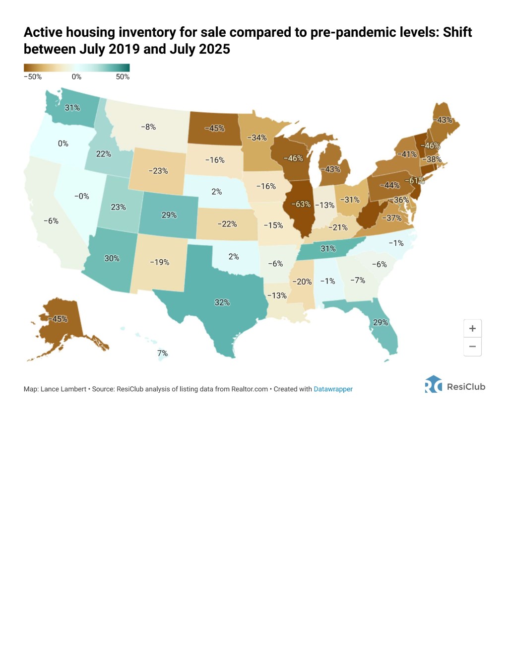
Phoenix Map Visual: Inventory Distribution (2025) This map shows active housing inventory changes compared to pre-pandemic levels, with Arizona at +30%, indicating a surge in listings statewide that impacts Phoenix metro.
Days on Market: Lengthening Like 1990s, Not Crash Extremes
In the 1990s, Phoenix DOM was estimated at 30-60 days in a balanced market, with slight extensions during early-90s softness.
During 2005-2007, DOM dropped below 30 days amid hot demand, spiked to 100+ days in the 2008-2011 crash, and normalized to 40-60 days by 2015.
In 2025, Phoenix DOM averages 62 days, reflecting increased buyer choice—similar to the 1990s’ adjustment phase, not the crash’s stagnation.
| Metric | 1990s | 2005-2015 | 2025 |
|---|---|---|---|
| Average DOM (Phoenix) | 30-60 days | <30 in bubble, 100+ in crash, 40-60 in recovery | 62 days |
Price Trends: Mild Dip Like Early 1990s
Phoenix prices in the 1990s rose 28-56% over the decade, with a mild <5% dip in the early-90s recession. Central areas saw ~3.2% declines from 1990-1992, followed by steady growth. Neighborhood-level data from that era highlights affordability contrasts: central and historic districts like Garfield and Coronado experienced softer pricing during the dip, while expanding suburbs in the East Valley (e.g., Mesa) and North Phoenix saw earlier recovery and moderate appreciation due to migration and development. Overall, the market avoided extremes, with median prices climbing from around $85,000 in 1990 to $130,000 by 2000, reflecting balanced growth.
The 2005-2015 era was volatile: prices doubled from 2000-2007 ($100k to $217k average), crashed 50-56% by 2011, and rebounded 50%+ by 2015.
In 2025, Phoenix prices are down 4.6% from 2022 peaks (median ~$450,000), with 4-6% appreciation forecast—aligning with the 1990s’ post-dip stability, not the 2005-2015 rollercoaster.
| Metric | 1990s | 2005-2015 | 2025 |
|---|---|---|---|
| Price Change | +28-56%; <5% early dip | +100% bubble, -50% crash, +50% recovery | -4.6% from peak; 4-6% growth forecast |
Phoenix Map Visual: Price Trends by Area (2025) This map illustrates price cut percentages across Phoenix neighborhoods, showing higher reductions in areas like South Phoenix (48.7%), indicating buyer leverage in certain zones.

Phoenix Map Visual: Price Distribution by Neighborhood (Mid-1990s) This graph represents mid-1990s price trends in Phoenix, with tiered indices showing low-tier homes at milder growth, highlighting central dips and suburban recovery.

Overall: Stronger Parallels to 1990s Stability
The 2025 market aligns more with the 1990s: declining rates, rising but manageable inventory, lengthening DOM, and mild price corrections leading to steady growth. The 2005-2015 period’s speculative bubble, severe crash, and uneven recovery contrast with today’s stricter lending and undersupply, preventing such extremes. Arizona’s job growth and migration bolster resilience, echoing the 1990s.
Actionable Lessons for Buyers:
- Leverage Easing Rates for Negotiations: Use online mortgage calculators (e.g., on Bankrate or NerdWallet) to model payments at current 6.3% rates. Pre-approve for a loan to strengthen offers, then negotiate seller-paid closing costs (up to 3-6% of price) or repairs based on inspections—aim for 2-5% off list in balanced areas like East Valley.
- Focus on Affordability to Avoid Speculation: Run a detailed budget analysis including property taxes (~1% of value in Phoenix) and HOA fees; target homes where payments are <28% of income. Research comps via Zillow or Redfin to ensure you're not overpaying, unlike 2005 bubble chasers.
- Capitalize on Mild Dips for Long-Term Gains: Identify undervalued neighborhoods (e.g., West Valley suburbs with slight growth) using heat maps; buy now with a 5-10 year hold plan, as 1990s buyers saw 28%+ appreciation. Schedule home tours in high-inventory zones for better selection.
Actionable Lessons for Sellers:
- Price Competitively to Minimize DOM: Obtain a Comparative Market Analysis (CMA) from a local agent; set list price 3-5% below recent comps in your neighborhood to attract multiple offers within 30 days. Monitor weekly feedback and adjust if no showings in the first two weeks.
- Stage and Offer Concessions for Appeal: Invest $1,000-3,000 in professional staging (declutter, neutral paint, curb appeal enhancements); include incentives like rate buydowns or home warranties in listings. Use high-quality photos and virtual tours to stand out, echoing 1990s success in balanced markets.
- Time Sales Proactively for Optimal Results: List in early fall (like now in October) before winter slowdown; prepare by fixing issues pre-inspection to avoid delays. If inventory rises further, sell sooner to capture current demand—aim for a 98% list-to-sale ratio by being flexible on terms.
With Phoenix-specific trends visualized—including 1990s price maps—clients can better target neighborhoods: central for value in dips, suburbs for growth. Contact me for tailored strategies to navigate this market effectively.